Jacks Agency
Jacks Agency is a conceptual brand identity created for a modern creative studio, designed to express boldness, clarity, and a playful geometric character.
00

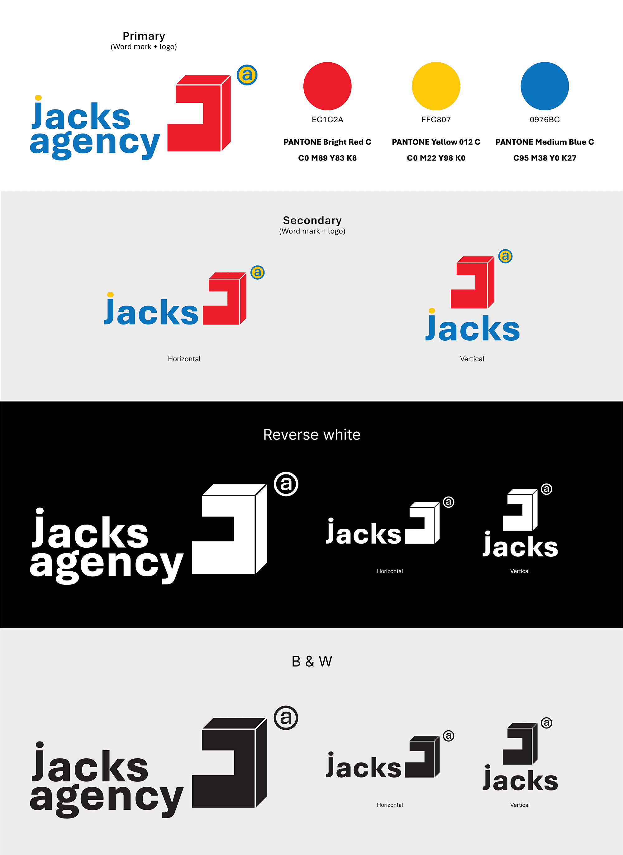
Jacks Agency is a conceptual creative-studio identity built around bold geometry, expressive colour, and a confident modern tone. The logo combines a sturdy, angular “J” monogram with a friendly rounded wordmark, striking a balance between structure and approachability. Its bright primary palette — red, yellow, and blue — reinforces the brand’s lively, optimistic personality, while the simplified shapes and clean construction make the identity adaptable across a wide range of applications.
Logo System
The identity includes both primary and secondary lockups, designed for flexibility across various digital and print contexts. The monogram works as a strong standalone symbol, while the full wordmark lockup provides clearer brand expression. Reverse-white and monochrome versions extend usability across light, dark, and minimal applications.
Design Intent
The JACKS identity draws from playful, geometric forms and a vibrant primary colour palette to communicate creativity, directness, and momentum. The simplicity of the shapes and the clarity of the colour system make the brand highly functional while retaining a strong personality. This approach allows JACKS to feel fresh, confident, and versatile across different touchpoints.
01

+
See also


