ARVO
A refreshed product direction and UI system to strengthen ARVO’s purpose and clarity.
00

Project overview
ARVO explores how to help working professionals reshape their roles through small, intentional job-crafting changes. Our team conducted in-depth interviews and uncovered the structural, emotional, and managerial factors affecting engagement. Powered by an AI-driven backend, ARVO aims to give users personalised guidance as they navigate career challenges. As UI Lead, I redefined ARVO’s visual identity and interface to create a clearer, more supportive experience aligned with the product’s mission of guiding users toward more meaningful, sustainable work.
Problem
Research showed that disengagement is driven by structural issues—overwork, unclear expectations, and limited psychological safety. Users were coping, not solving. They also felt overwhelmed by existing tools, skeptical about value, and resistant to “another app” that demanded more emotional labour or time. ARVO’s early design did not fully communicate clarity or support.
Solution
Our team reframed ARVO with a more grounded purpose: guiding users clearly through career reflection and decision-making. I redesigned the interface with a warmer, more structured identity—rooted in optimism, clarity, and usability—to reduce friction and make guidance more approachable. This created a more expressive foundation for ARVO’s next phase.
Through interviews with 15 professionals, our team mapped disengagement triggers, coping patterns, structural constraints, and trust barriers. These insights shaped ARVO’s repositioning. My role focused on UI direction — evolving the logo, visual system, typography, and screen hierarchy. The goal was to craft an identity that feels positive, encouraging, and aligned with ARVO’s mission of clarity and forward momentum.
Research Approach
We interviewed mid- and early-career professionals to understand disengagement, job-crafting attempts, and systemic blockers. Mid-career users articulated clearer issues—burnout, unclear expectations, and limited influence—making them the primary research focus given ARVO’s existing product direction.
Key Insights
Users aren’t struggling with self-awareness—they’re struggling with systems. Coping strategies help them survive, not thrive. Structural barriers like management, culture, workload, and low psychological safety limit any real change. These patterns informed ARVO’s need for clearer guidance and supportive framing.
Engagement & Receptivity
Participants were skeptical about B2C self-improvement apps due to complexity, loneliness, and digital fatigue. However, they were open to structured guidance—if it’s fast, contextual, and emotionally supportive. These insights shaped how ARVO’s UI needed to feel: approachable, optimistic, and not burdensome.
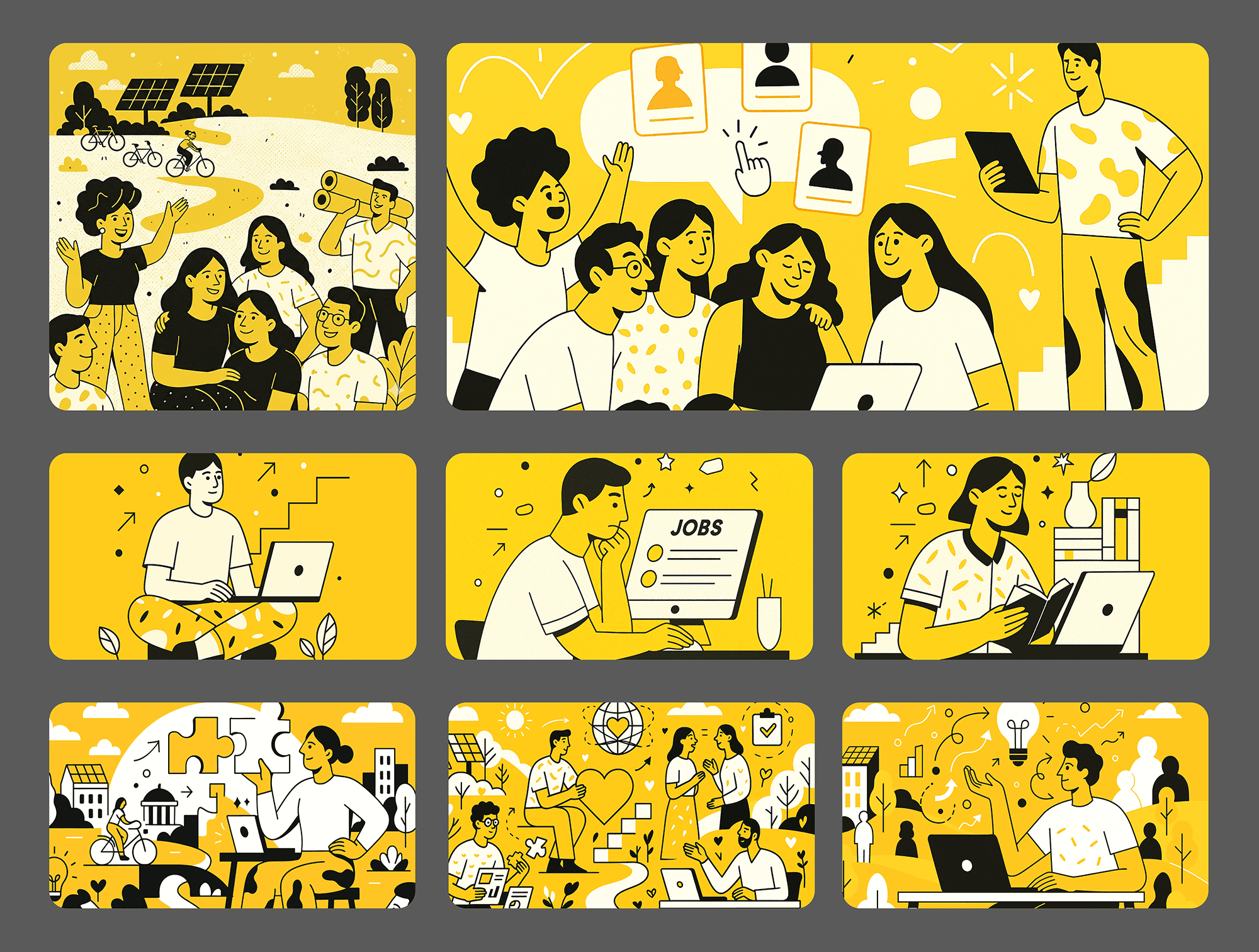
Visual Identity & UI Direction
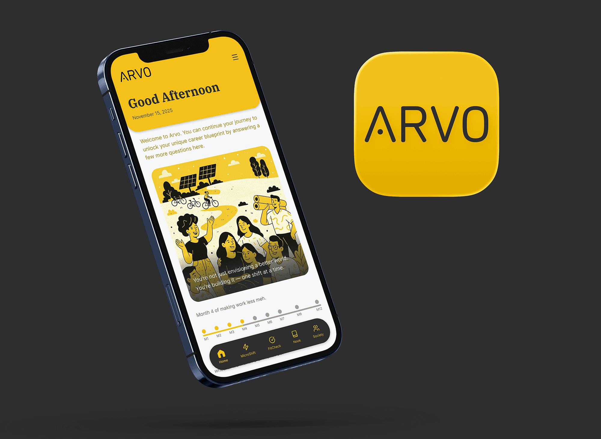
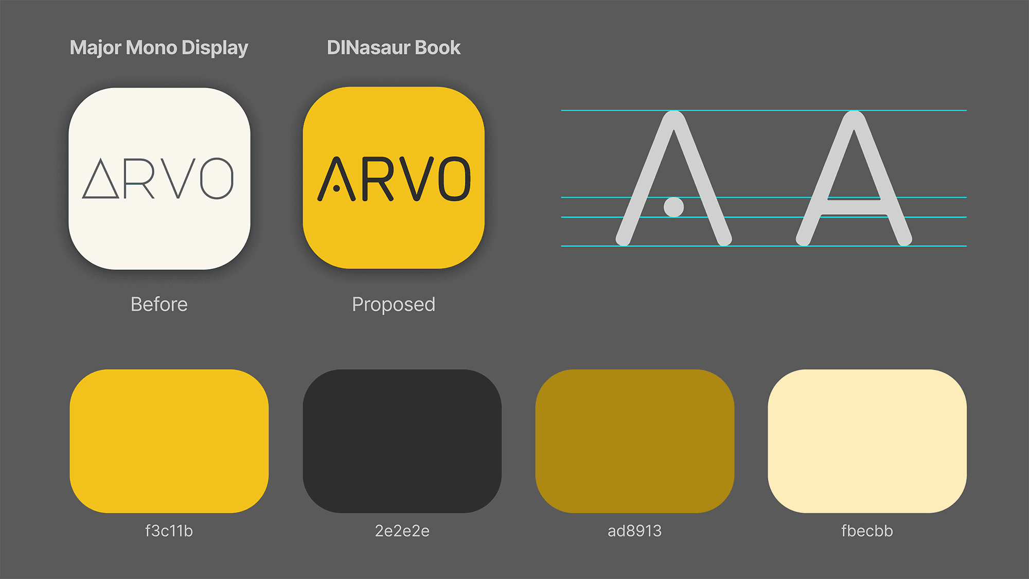
I explored how colour, typography, and layout could convey encouragement without overwhelming users. Yellow became the primary signal of energy and optimism, paired with structured layouts and approachable shapes to reinforce guidance and clarity at every touchpoint. This redefined ARVO’s emotional tone.
Design System & Branding
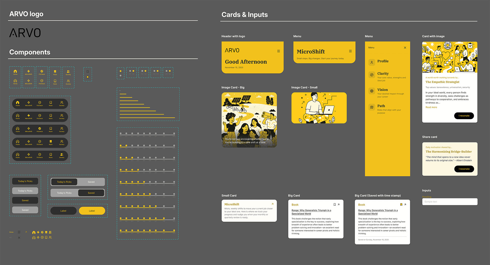
As UI Lead, I developed ARVO’s updated design system—evolving the logo, strengthening the colour system, modernising type pairing, and refining hierarchy. This formed a flexible foundation that aligns the product’s mission with a more expressive and meaningful brand identity.
Using Figma Make for Rapid UI Exploration
I used Figma Make to quickly generate high-fidelity screens by feeding in ARVO’s design system, components, and UI rules. This allowed me to explore layout variations rapidly, then refine the versions manually. It significantly accelerated prototyping and enabled our team to validate flows earlier in the process.
Combining Figma Make + ChatGPT for Visual Development
To strengthen ARVO’s personality, I generated contextual illustrations by prompting ChatGPT with our specific visual style requirements. These assets were then incorporated into layouts produced by Figma Make, creating a seamless workflow where AI-generated visuals informed interface direction. This hybrid approach sped up production while keeping the design expressive and cohesive.
The client welcomed our research outcomes and appreciated the actionable nature of our recommendations. They are now assessing how best to incorporate these insights into ARVO’s upcoming releases and broader product vision. I’m excited to see the product evolve and look forward to its launch soon.
01

This brand guide outlines ARVO’s refreshed identity system, including logo construction, colour palette, typography, and usage rules—establishing a clear, consistent foundation for both product UI and future brand touchpoints.
02

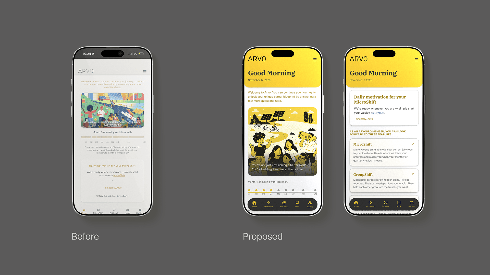
The refreshed ARVO screens feature a welcoming home view with improved hierarchy and a friendlier tone, helping users ease into reflection whenever they open the app. The updated visual language — with a warmer palette and rounded, approachable typography — creates a more human, supportive, and emotionally accessible experience throughout the interface.
+
See also


