ARDEN
A mindful nature companion app designed to guide first-time visitors at Sungei Buloh.
00

Project Overview
ARDEN is a nature trail companion designed by our team to support first-time visitors exploring Sungei Buloh. Through on-site research and iterative testing, we identified gaps in navigation and wildlife discovery. As UI Lead, I focused on shaping a clear, calming interface and building a coherent design system that enhances the overall visitor experience.
Problem
Visitors often feel uncertain navigating Sungei Buloh. Trail distances, closures, and signboard placement create confusion, while wildlife information is scattered across multiple sources. This disrupts the sense of calm visitors seek and makes it difficult to explore confidently without constantly stopping to check maps or search online.
Solution
Our team designed ARDEN as a unified companion that brings trail navigation, wildlife identification, and updated site information into one seamless experience. My focus was on crafting a clear visual hierarchy, intuitive flows, and a nature-inspired interface that helps visitors explore confidently while staying fully present with their surroundings.
As a team, we conducted field interviews, competitive analysis, ideation, prototyping, and on-site usability testing. In my role as UI Lead, I developed the design direction, visual system, and final interface of ARDEN. The goal was to transform the reserve’s fragmented information into a calm, guided digital companion tailored for first-time visitors.
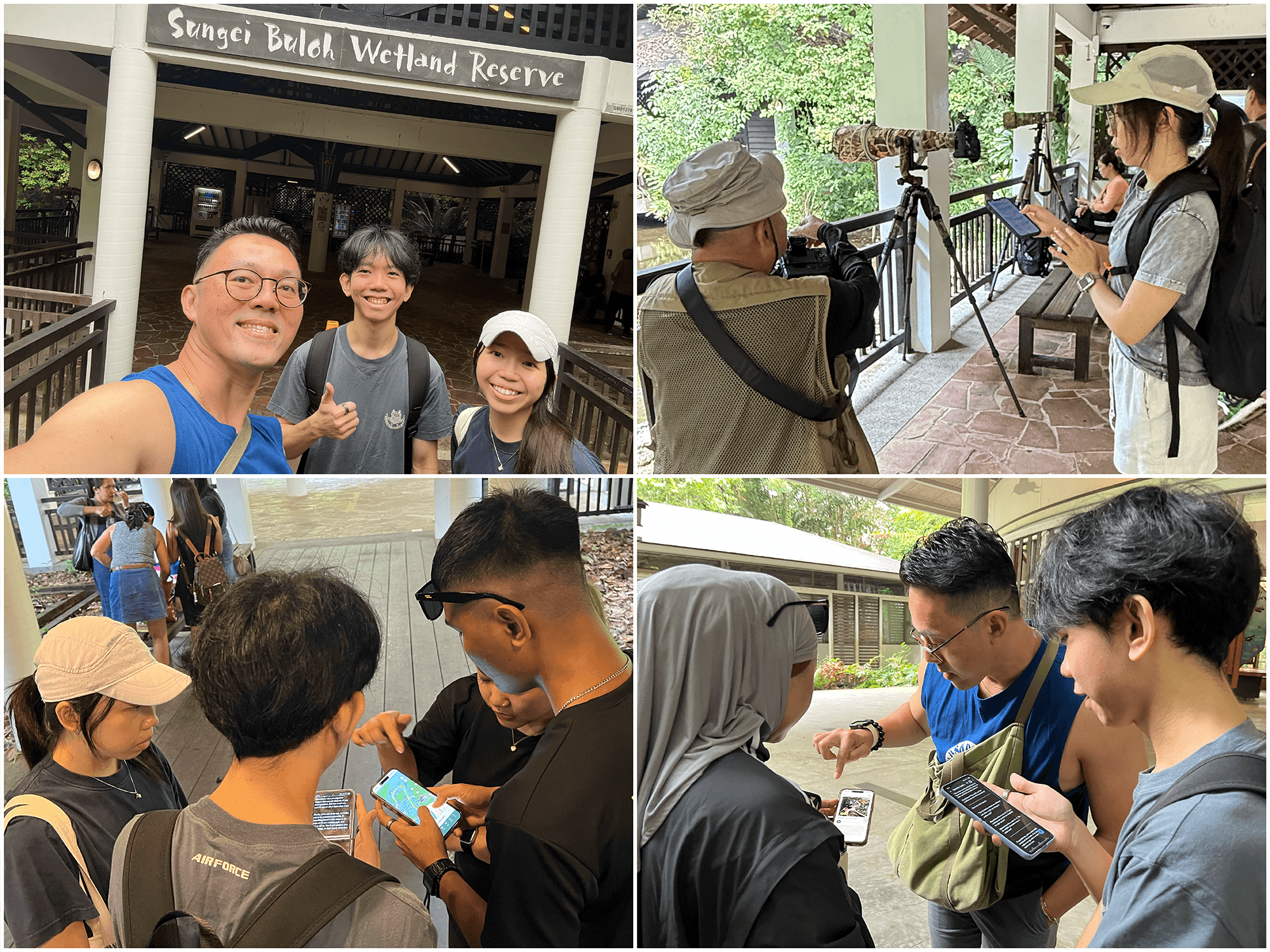
Research Approach
Our team interviewed 15 visitors and observed how they navigated the reserve. We learned that first-time visitors experienced the most difficulties, from unclear signage to uncertainty about trail closures. These insights shaped the direction of ARDEN’s feature prioritisation and UI structure.
Key Insights
We identified three core themes: people visit for relaxation, enjoy wildlife spotting, and struggle with navigation. Many relied on signboards but still felt unsure of their location or route. These patterns guided how we structured ARDEN’s main screens and information flow.
Navigation & Wildlife Challenges
Visitors often photographed maps for reference, were unaware of updated trail conditions, and couldn’t identify species without help. These real-world behaviours highlighted the need for clearer maps, stronger visual indicators, and simplified wildlife information within ARDEN.
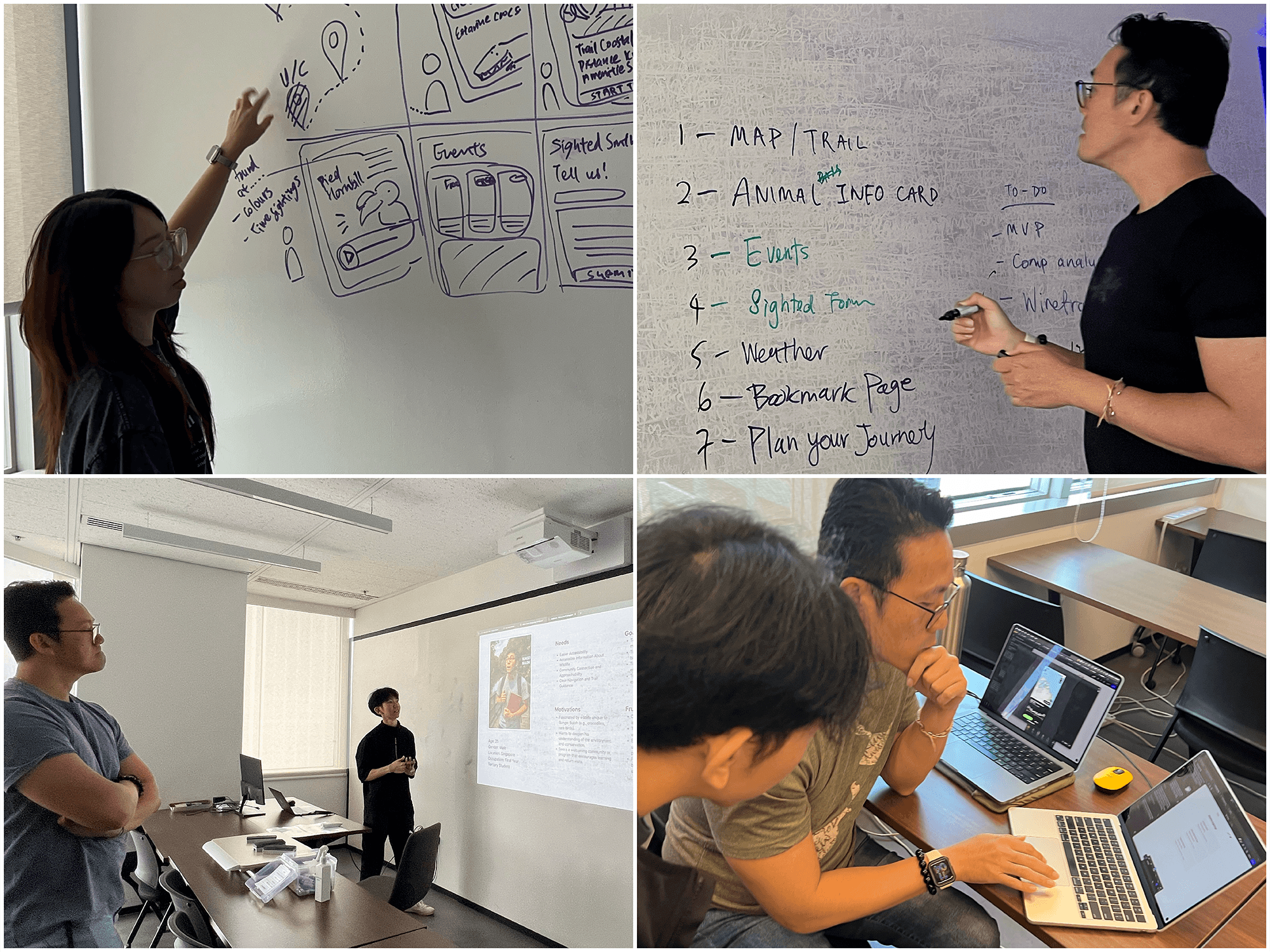
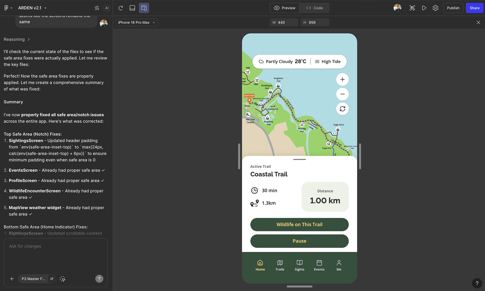
Using Figma Make for Ideation
I used Figma Make to rapidly generate layout variations and UI structures by feeding in my Figma screens. This accelerated the exploration phase and allowed me to prepare a high-fidelity prototype quickly for on-site user testing. Many users assumed ARDEN was a real, app-store-ready product. Figma Make also enabled fast iteration of ARDEN’s screens based on live user feedback.
UI Design & System Thinking
Beyond screen layouts, I built ARDEN’s design system, establishing the colour palette, typography, iconography, and spacing rules. This ensured consistency across flows while reinforcing the brand’s gentle, exploratory tone throughout the experience.
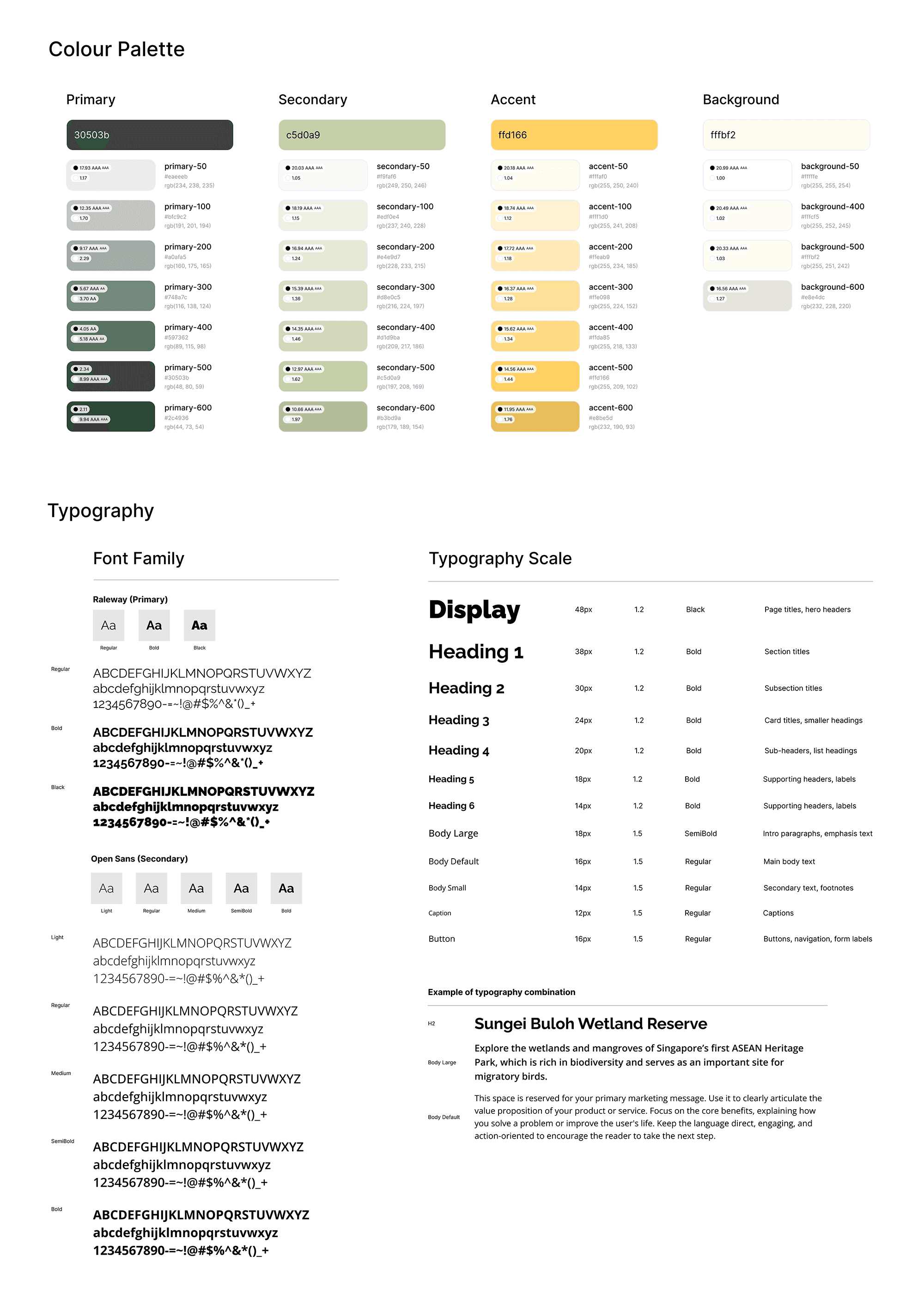
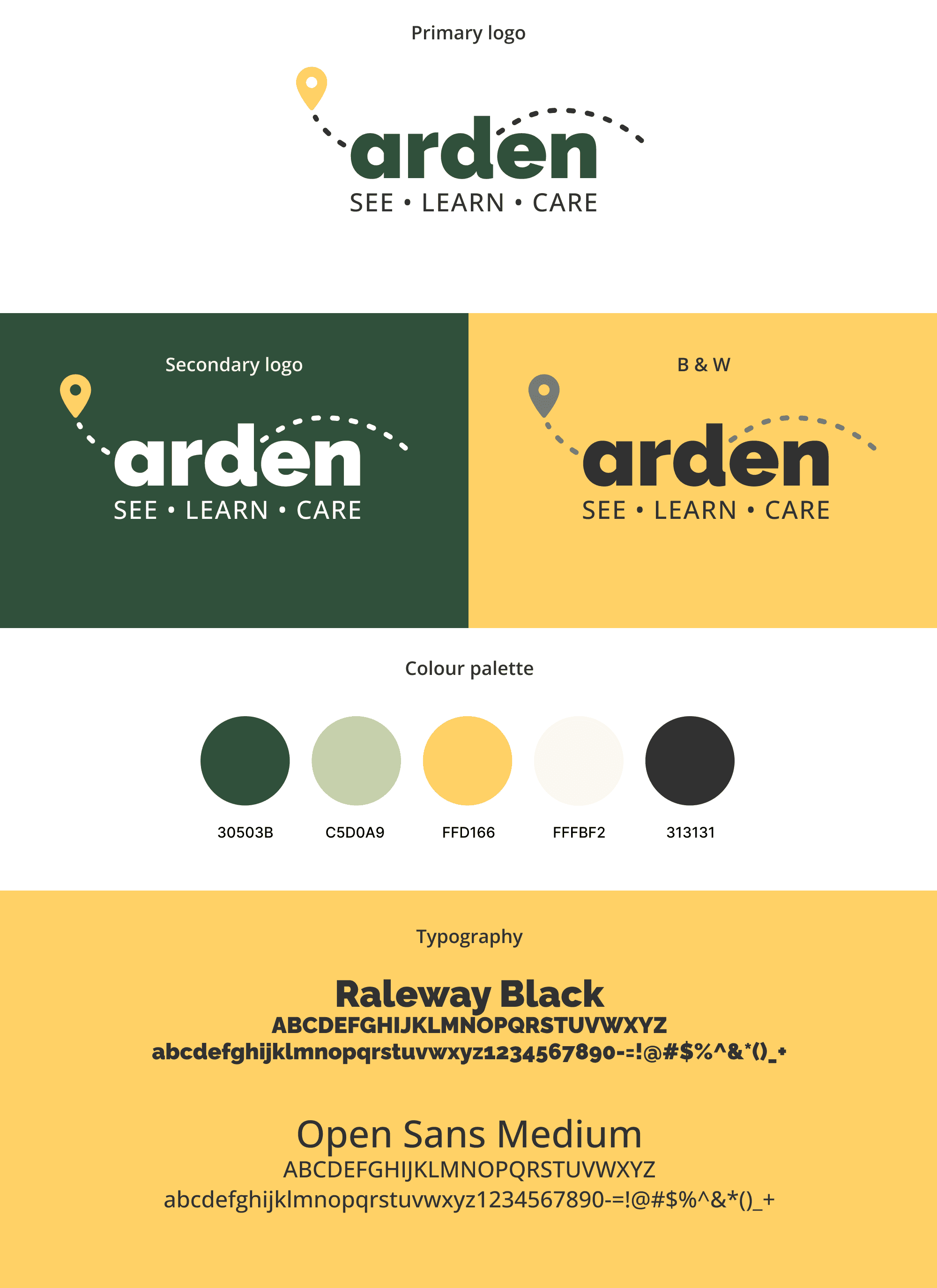
In addition to leading the UI design, I created the branding for ARDEN—developing its visual identity, tone, and the core concept “Walk with Nature, Learn from the Wild.” This branding direction shaped the app’s calm palette, soft forms, and guiding character across the entire product.
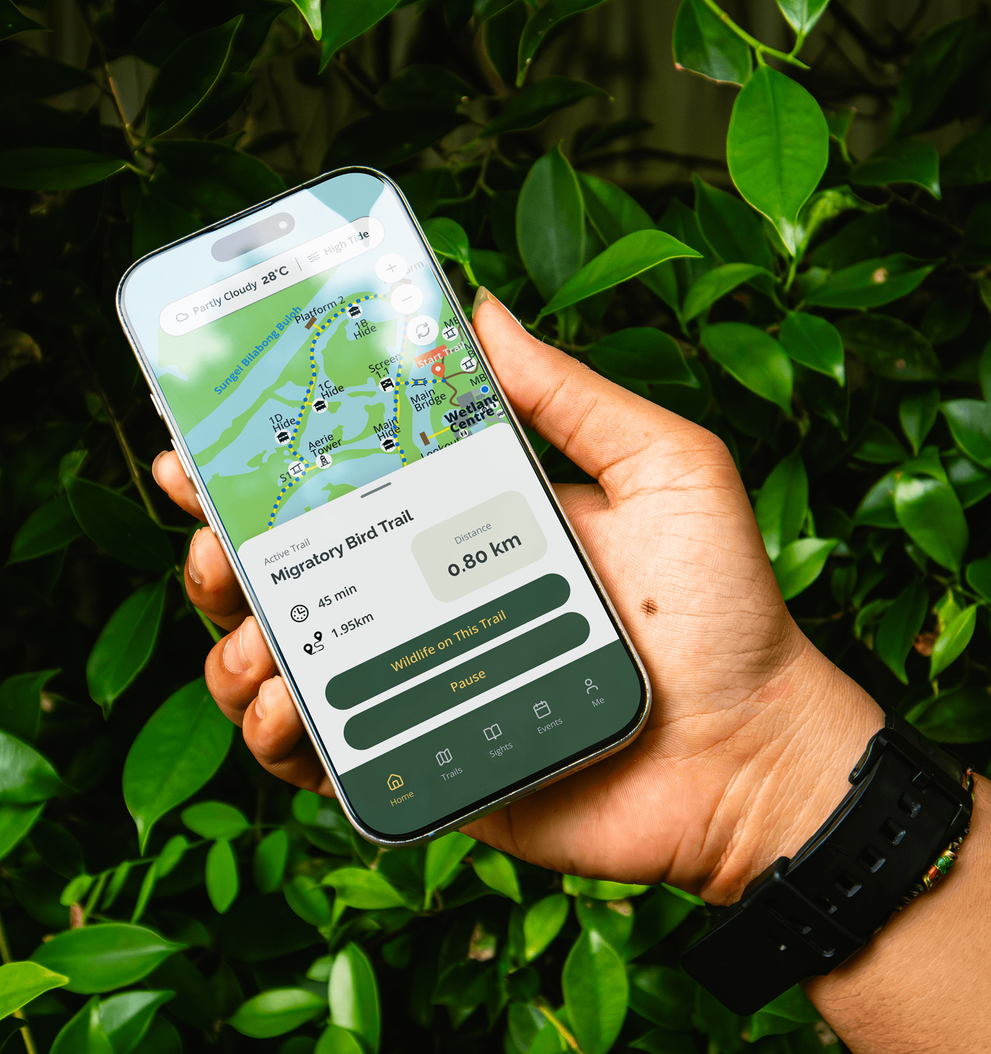
PROTOTYPE
01

ARDEN’s screens bring together clear maps, guided trails, and wildlife details to support a confident and intuitive nature exploration.
+
See also


